With the age of digital photography now becoming a mainstream part of society, how do you decide what photos are good to keep and what ones should be thrown in the trash? While we need reasons to reject an image, we don’t necessarily want to form a hypothesis of rules. If you ever take a workshop with me you will quickly realize that I choose to disregard rules in almost every aspect of my life and my photography. And I believe that creativity cannot be contained within a set of rules. Rules force us to follow a standard of practice, and while that may work for controlling crime, slowing down speeders, and successful scientific discovery, it completely ruins the concept of creativity.
While my way of teaching others how to create a compelling image differs from the norm due to my educational background as an architect, there are areas of image making where decisions have to be made. So in a world of creative decision making that has many drinking the Kool-Aid of free expression, how do I decide on what work to keep? Here are 5 reasons to reject an image that I have discovered work best in most image making scenarios. Just like rules, plan on disregarding any of these reasons for, well, any reason.
No. 1 – Blurry without Intended Motion

While there are certainly times when I intentionally blur part or all of my image. There are also many times when I do the same unintentionally. Too slow of a shutter speed to be hand holding, wind vibration, and even accidentally kicking my tripod have all ruined images. How do we identify this type of blur? Simple. There is typically a ghost or halo of the original image just pixels away from what is somewhat sharp in the very same image. These cypress trees were taken handheld in Florida just after I purchased a new Canon 1D Mark III. I made three very simple mistakes that could have kept this image tack sharp. One, I used a shutter speed of 1/13th of a second. Way too slow for handholding even when using a 17-35mm lens (a great suggestion is to at least match your focal length with your shutter speed – this image was taken at 26mm so if I used 1/25th of a second or higher I could have had a better chance of succeeding). Two, I used an aperture of f/22. Way too small of a lens opening for this shot, f/11 probably would have sufficed. And finally, three, I used an ISO of only 100. Very easily I could have fixed any one of my camera settings to get more speed and the image would have been sharp. Or I could have put the camera on a tripod and succeeded with the chosen settings.
No. 1 – The Solution

Many years later with a very similar situation in Big Sur, California, I chose almost the same exact settings in camera. The difference this time around – I put the camera on a tripod. Notice how much detail there is in the bark and lichen of the branches.
No. 2 – Distracting Elements

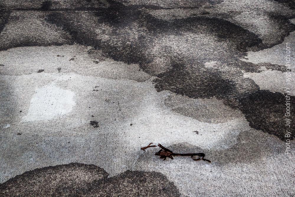
When I stumbled upon this patterning on a sidewalk in Astoria, Oregon I also discovered someone else’s trash – a rotten banana peel. I could have cloned the peel out using Photoshop CC, but it was just as easy to pick it up and throw it in the trash where it should have been discarded in the first place. In this composition the peel offers a tangible element in a completely abstract field. Without the peel, you have a harder time figuring out what the literal translation of the subject is in your mind. Thus, I keep you lingering on the photo longer.
No. 2 – The Solution

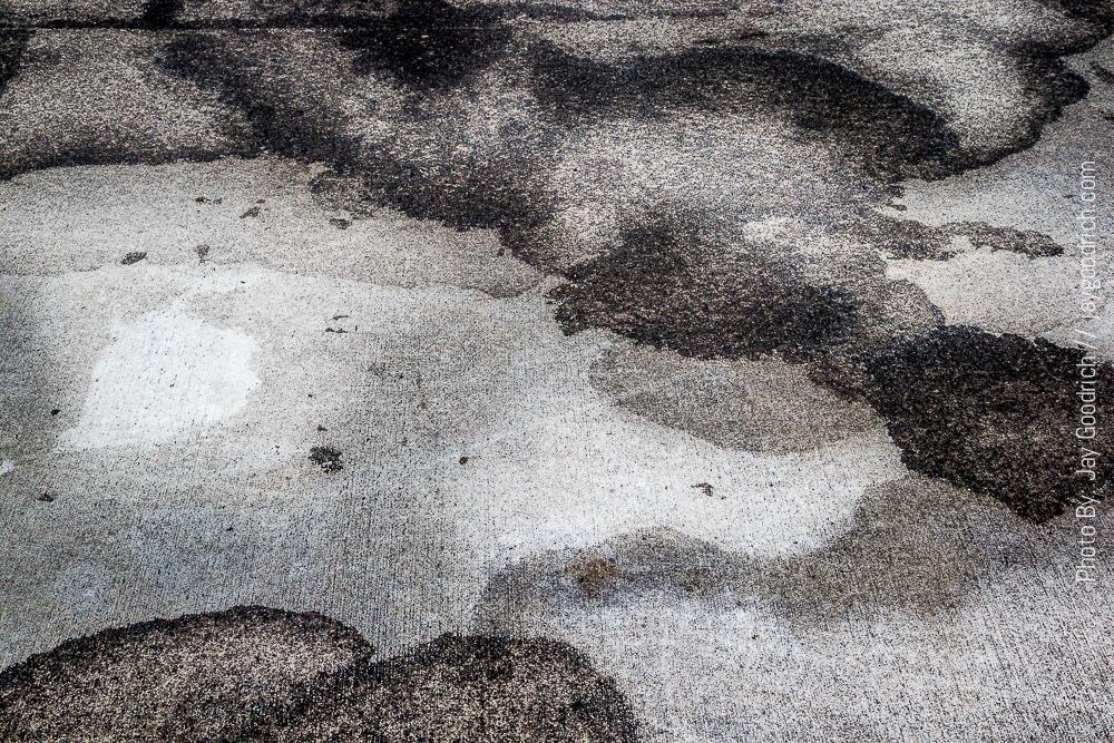
Much cleaner and makes you think about what you are looking at bit longer.
No. 2 – For Every Reason there is an Equal and Opposite Reason

Now you would probably think that the dead tree trunks are the distraction here. I believe that their hard-edged, detail-less lines add to the overall abstractness of the image. It takes the viewer a moment to realize that they are looking at reflection in a lake. The entire image is successful because of the angularity of all of its elements. The ice is what gives you the answer to the overall image concept.
No. 3 – Lack of a Specific Subject

This dramatic cloud and silhouetted trees at sunset have a few good qualities, but you struggle to figure out what the subject is. Is it the trees or is it the clouds? In addition, the crop through the trees seams less decisive and more of a guess. Is my subject the brighter clouds? Or a study of blue? Nothing hits me over the head here, and thus my lack of subject has you disregarding the image and moving on.
No. 3 – The Solution

A well-composed image that has a strong foreground subject (Flowers and Lichen Covered Boulder) and a strong background subject (Sunrise on the Tetons). Notice how your eye flows from front to back of the image. And you search for all of the little details in between.
No. 4 – Underexposure

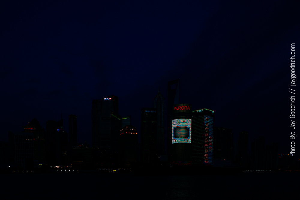
Today, we can fix a poor exposure (within reason) in Lightroom or Photoshop as long as we are shooting RAW in the field. However, exposing too dark will push way too much noise into our original capture when we try to lighten it, thus degrading the final product. This image is perfect example of when not to try to lighten after the fact. There are many photographers who say you should never “chimp” your LCD/histogram. Really? Why not use the tools available to us to succeed on as many levels as possible? This is how I obtained the proper exposure in the field and walked away with a successful image of the skyline of Shanghai.
No. 4 – The Solution

A proper exposure. Simple enough. And NO noise.
No. 5 – Inaccurate Focus

Notice how my focus is on the nest. That doesn’t help my cause at all when the adult osprey is looking right at the camera now does it? So this image would succeed if the eyes of the adult bird were tack sharp. The motion blur of the chicks is fine in my opinion especially because it highlights how excited they get when mom or dad flies in with a meal.
No. 5 – The Solution

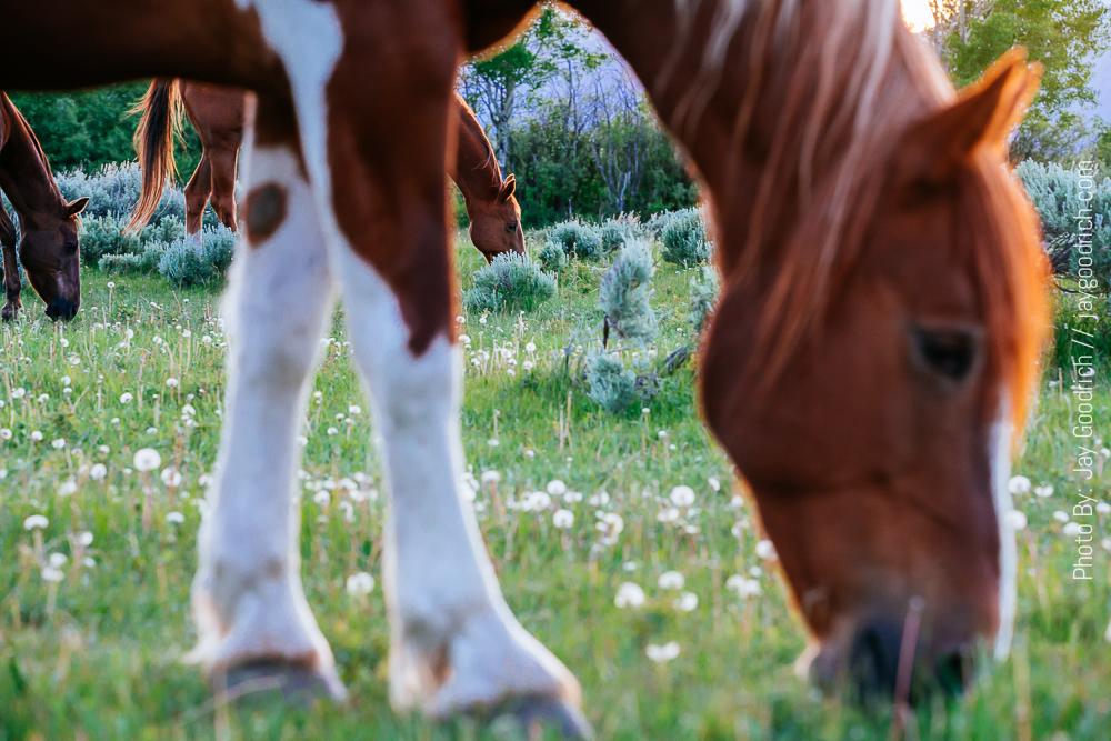
Now you may question my thought process here, but I chose to focus on the horse in the background intentionally. Why? Because our eyes search for the sharpest element in a photograph. If we don’t find something that is sharp we look elsewhere. By focusing on the secondary subject, not the main foreground horse, I am forcing you again, to spend more time on the image. I used the out of focus foreground horse to frame the sharp background one so you at least begin to figure out what is going on here in the image. In addition to all of this explanation, focusing on the background horse adds depth to the image. Your eyes enter and travel farther into the image. This adds a three dimensionality to a two dimensional process.
Photography is a very complex medium. Not only are there creative variables to a successful image, but there are the scientific ones of actually controlling your camera as well. All totaled, I would safely say there are a million ways to succeed and to fail at creating a compelling photograph. It is a lifelong pursuit that may never hold a finality for my soul. I truly believe the only way to succeed at it is to take every given situation with an open mind and open heart, and never stop experimenting and practicing your craft. Hopefully these five reasons to reject an image will help you make more concise decisions in the very near future.


