Here a just a few brief tips for mastering the art of composition.
Composition is the logical arrangement of elements so that their relationship is pleasing to the eye. The elements are things that make up the scene (e.g. lines, shapes, texture, patterns, colors, tones, light, etc.).
Let’s be honest, some people seem to have an easier time with composition. They appear to be born with an artistic eye or, should I say, an inner vision. The rest of us need to develop it through practice and visual stimulation.
You will have to pay special attention to all the elements in a scene. Not just your main subject but also the small things. Once you start to notice these things, you are beginning to see. Once you are seeing, mastering composition is within reach.
Keep It Simple
One of the most effective tools you can use in composition is to simplify.

Learn to look at the entire frame and eliminate elements that don’t need to be there. If something in the frame isn’t supporting what you’re trying to show, don’t include it. You need to show your subject clearly, leaving no confusion on the part of the viewer about what you were photographing
Frames
Elements and lines within the scene can be used to create implied or actual frames. Use these frames within the photograph to call attention to your subject.

Lines, Lines and more Lines
Lines in photographs provide a path that lead the viewer’s eye from one element to another and hopefully, keep the viewer in the photograph. There can be many types of lines in a photograph.
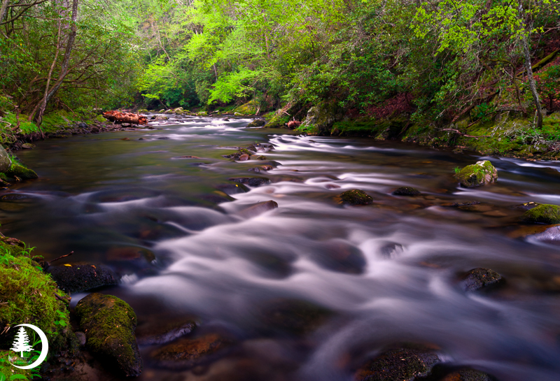
Create a Sense of Depth
Images that are well executed tend to have three distinct regions.

Foreground leads the viewer into the scene – it provides a starting point. So, you should probably include something of interest that will anchor the image.
Middle ground may contain the main subject of the image. It may also serve to move the viewer along to the background.
Background, like the middle ground, may contain the main subject, or it may merely provide a pleasing completion to the image.
Using Color
Color, more than any other design element, determines the emotional content of a photograph.

A light subject will have more impact if placed against a dark background and vice versa. Contrasting colors may be used for emphasis, but can become distracting if not considered carefully.
I use a Singh-Ray LB Color Combo polarizer for many of my images – and for all of the ones here. In fact, it’s the only polarizer I use. I like how the colors are so much richer and cleaner than other polarizers, not to mention the unmatched Singh-Ray clarity. For me, nothing else compares!